Gatorade Premium Skincare Extension
Brand Identity | Packaging Design
Base on the given brand (Gatorade), design the packaging for a skincare product line extension.
14 weeks project
Selected to display in ArtCenter Gallery
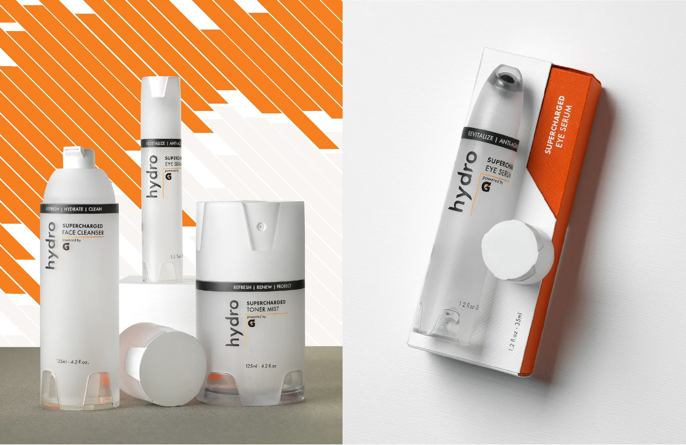
Hydro powered by G is a skincare product line aimed at active people to keep their skin clean and hydrated throughout the day, so they can perform in their peak at anytime.
The packaging is designed to elevate this product line to a premium level and to be displayed in department stores(Bloomdale’s, Nordstrom, Neiman Marcus).
Brand Identity
Gatorade is invented in the summer of 1965 for the Gator Football team to replenish the carbohydrates and electrolytes lost in sweat with a precisely balanced carbohydrate-electrolyte beverage. Gatorade focus on boosting athlete’s performance by providing hydration, energy and recovery. Now, Gatorade is moving towards to premium products with its premium lines: Gx and G ESSNTL
Logo Design
Keeping the energy in Gatorade and adding soft features to express hydration. With minimized G logo, it makes the new logo fresh, clean and premium.
Packaging Design
The frosted look is inspired by the condensation on a Gatorade bottle.
The grooves are widely used on Gatorade products.
The color is more sophisticated orange.
The paper packaging is made with textured premium paper.
Key attributes: Completion | Effective | Fast | Hydrated | Athletic | Premium


